Site Studio
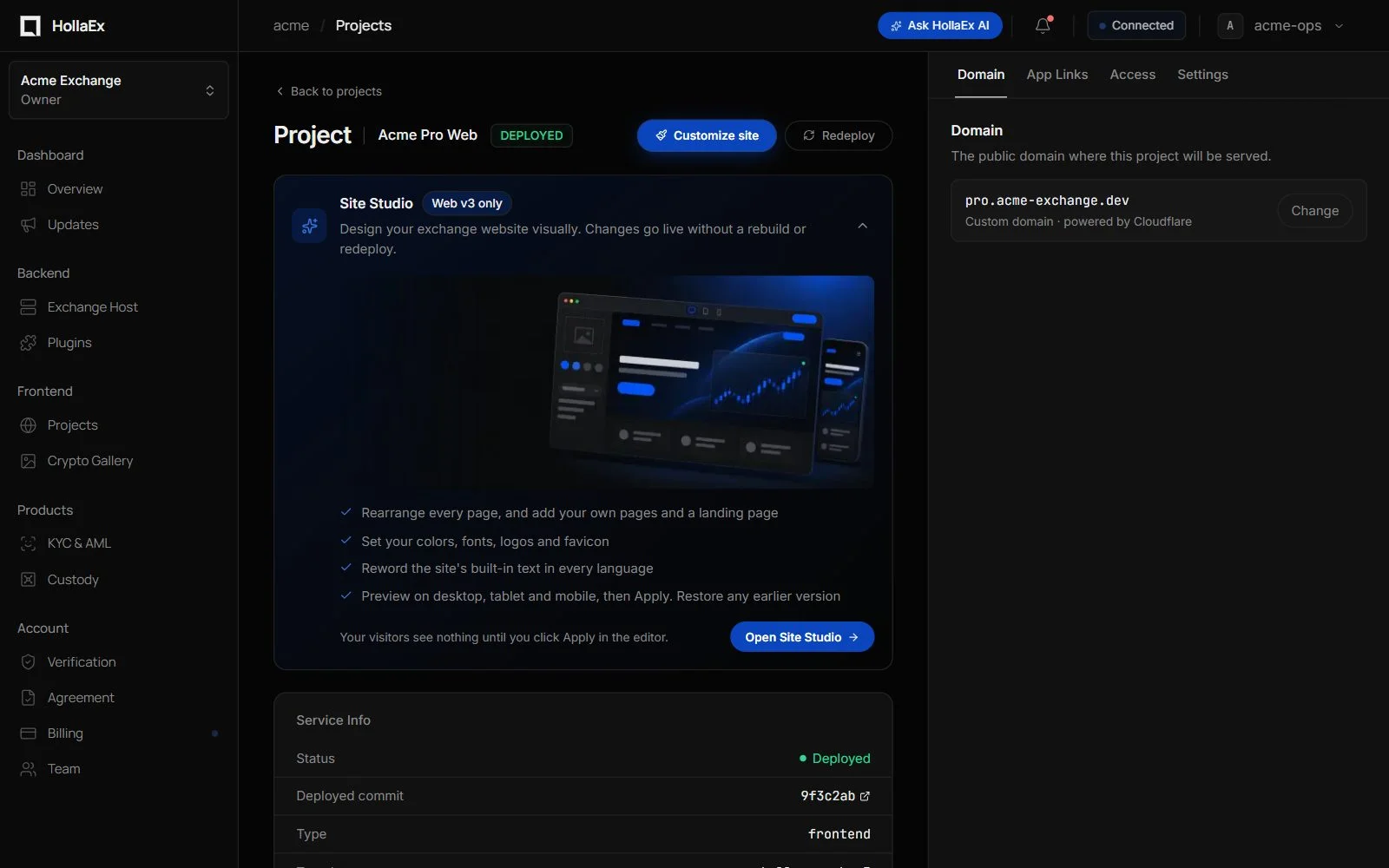
Start with the HollaEx Web v3 & Site Studio overview for what it is, plan requirements and how to publish. This page is the full editor reference.
Site Studio is the visual editor for HollaEx Web v3 websites. Open it with the blue Customize site button in the project header, or Open Site Studio on the Site Studio card on the project page. The editor opens full screen, with an exit control to return to the dashboard. You can lay out every page of your exchange website, add your own pages and a landing page, change colors, fonts, logos and wording, and apply changes without rebuilding the site.
Customize is only available after the website is deployed to a domain, because the editor runs inside your published site. Until then the button is greyed out and its tooltip says "Deploy this website to a domain first. The editor runs inside the published site."
Only HollaEx Web v3 supports Site Studio. Websites that can use it are marked Site Studio in the Projects list. A HollaEx Kit v2 Web website is customized from Operator Controls instead. Other websites show No Site Studio on the project page where the button would be; hover it to see how that website's design is changed.
Who can use it
- Owners and admins can edit, apply changes and restore any website in the exchange.
- Tech members can edit and save drafts on websites they're assigned to, but can't apply changes or restore.
- Business and billing members can open websites they're assigned to in view-only mode ("You have view-only access.").
- Anyone else sees "You do not have access to customize this website."
- A few settings reach beyond the look of the site, so only the exchange owner can change them: page scripts, Google Analytics on signed-in pages, hiding the site from search engines, and search console verification codes. Everyone else sees them read-only, marked with a lock.
The editor
The editor has two modes, switched with Edit and Design at the top:
- Edit changes the words, pictures and blocks on the page you're on. Click anything on the page to select it, and its settings open in the panel on the right, in three tabs: Content, Look & size and Who sees it. Nothing selected? The panel says "Click something on the page" and offers Add a block and a shortcut to Design. Each block's panel says once which language you're writing in.
- Design changes the look of the whole site. Site style on the right has theme presets, the brand color, colors for light and dark mode, corner roundness and the font, and under Logo and background the logo files and the page background image. In Design the page can't be edited, apart from the logo (see below).
In Edit, a row of tools down the left opens panels over the page. Each one closes again with Esc, its close button or a click elsewhere:
- Layers: every block on the page, section by section. Click one to select it and scroll to it. The eye hides or shows a block.
- Add: click a block to put it right after the one you selected (it's then selected and scrolled into view), or drag it onto the page. Layout has the two kinds of section: a row of blocks, or a group of tabs where each tab holds its own blocks. A page can have up to 12 sections, a tab group up to 12 tabs, and a section or tab up to 32 blocks. Select a section or block to move it up or down or remove it.
- Pages: every page a visitor can reach, grouped by area: Summary, Wallet, Trade, Earn, Account, Sign in and Landing page ("Exchange pages"), plus the pages you created ("Your pages"). New page is at the top. Hidden pages are marked Hidden and "Not on your site yet", with a Show… button that opens that page's setting to turn it on.
- Text (Languages & text): reword the site's built-in text. See Text overrides below.
- Settings: opens Site settings (also in the ⋯ menu): your site's name, page titles and link previews, social profiles, analytics and page scripts, and search engine settings. See Site settings below.
Across the top:
- The page menu shows the page you're editing and its address. Pick another page there. Site Studio opens on your landing page once it's shown, otherwise on your summary.
- The editing language selector: the language that block text, tab names, page names and text overrides are edited in.
- Undo / Redo (undo keeps the block you were working on selected), the save status, Preview, Apply and the ⋯ menu (Save draft, Applied revisions, View live site, Site settings, Help and Take the tour).
- Above the page: Desktop / Tablet / Mobile, zoom, full screen, and the sun and moon switch to see the site in light or dark mode.
Signed-in pages (Summary, Wallet, Trade and the rest) are shown inside your app's sidebar, with your logo and menu, as your customers see them: open on desktop, narrow on tablet, and none on a phone, where the app uses its own bars. Menu entries for features that are turned off are left out, as on the live site.
Changing the logo on the page: click the logo at the top of the sidebar. Hovering shows Change logo, and if there's no logo yet the spot is outlined and says Add your logo. The upload opens right there and changes the logo for the mode you're previewing (light or dark), or the app icon on tablet. All logo and brand files opens Design at the logo settings. This works in Edit and in Design.
Preview hides the panels so you see the page the way visitors do. On signed-in pages the sidebar menu works: click an entry to open that page, still in Preview. Back to editing brings the panels back.
The preview uses sample data and trading actions are disabled. Nothing reaches visitors until you click Apply and confirm.
The first time you open the editor, a short tour points out your tools, the page, Edit and Design, Site settings and Apply. Skip tour closes it; to see it again, choose Take the tour in the ⋯ menu or in Help.
Pages
Laying out an exchange page
Every bundled page (summary, wallet, trade, earn, account settings and so on) can be rearranged. A page you haven't touched keeps following the HollaEx template, so product updates to that page still reach your site. Only what you change is stored.
In Page settings you can:
- set the page name and Search listing (page title, description, keywords);
- choose Show in top navigation and/or Show in sidebar;
- make it Visible to signed-out visitors or keep it for signed-in users;
- turn off Show this page on the site to hide it: a hidden page has no address and no menu entry, but its design is kept so you can show it again later. The summary page and the sign-in pages can't be hidden;
- Reset to default: discards your changes to that page and restores the layout it ships with.
Some sections hold a block the page needs, so they can't be removed ("Holds a block this page needs, so it cannot be removed."). A page needs at least one section, and a tab group at least one tab.
Your own pages
Click New page, give it a Page name and a Page address (letters, numbers and dashes; it becomes /app/<address>). Renaming the address later keeps the layout. A new page starts empty and requires sign-in unless you make it visible to signed-out visitors. It can't take over the address of a built-in page. Delete page removes it and its menu entry once you apply your changes.
Landing page
The landing page is what signed-out visitors see at your site's address. Signed-in users still go to their summary. It ships hidden, so your site's root keeps working as before until you turn it on: open Pages, click Show… beside Landing page (or turn on Show this page on the site in its Page settings), then apply your changes. Once it's shown, Site Studio opens on it.
Its template has an animated hero (with floating market cards drawn from your exchange's own coin logos, or a drawn chart), a row of figures that count up, three feature cards, the markets table and a call to action, with the signed-out header and footer. All of it is editable like any other page, and animation is reduced for visitors who turn on reduced motion.
Blocks
Any block from any page can be placed on any page. The exception is blocks that belong to a specific route (for example, coin detail pages) and the sign-in forms, which stay on their own pages.
Exchange blocks include Account overview, Performance, Announcements, Markets, Portfolio, Watchlist and Quick trade, plus wallet blocks (deposit and withdrawal forms and history, all assets, allocation, address book), trade blocks (price chart, order book, order form, open orders, all markets), earn blocks (earn summary, referral, staking) and account settings blocks.
Content blocks you write yourself:
- Heading: text, size (large, medium, small) and alignment.
- Text: up to 2,000 characters, size and alignment.
- Image: an upload or an https image address, a description, an optional link, fit ("Fill the frame" or "Show whole image") and height.
- Button: text, link, style (solid, soft or outline) and alignment.
- Banner: title, text, button, image beside or behind the text, color (brand, card or dark) and alignment.
- Spacer (small to extra large) and Divider.
- Hero: a small line above the heading, a heading, text, up to two buttons, an optional background photo, and an illustration (floating market cards, an animated chart, or none).
- Statistics: up to six figures with captions, for example "150+" and "Markets".
- Feature card: an icon (shield, lightning, globe, chart, wallet, lock, people, support, coins, rocket, star or clock), a title, text and an optional link.
- Custom HTML: your own markup, up to 32 KB. It's shown in a sandboxed frame with no access to the page, its cookies, storage or the user's session. Forms don't work inside it and links open in a new tab. Choose its height: fit the content, short, medium, tall or extra tall.
Content block text is plain text (no HTML or markdown) and is entered per language.
Plugin blocks: plugins installed on your exchange can add their own blocks, with settings you edit under Plugin settings. If a plugin is removed, its block is kept but not shown ("This plugin is not installed on this exchange. The block is kept but not shown.").
Every block can have:
- a width for desktop, tablet and mobile, in words such as "Half the row", "Two thirds of the row" or "The full row", and Show block on or off;
- a Title above the block;
- a Block background (none, card, brand tint or brand) and Inner spacing (none to large);
- Who sees it: everyone, signed-in users only, or signed-out visitors only;
- Show on desktop / tablet / mobile, to hide it on some screen sizes.
The Portfolio block also has Show portfolio chart and Show asset balances.
The Quick trade block also has Custom CSS: restyle its parts (for example .review-button or .from-amount) or hide its optional parts, marked * in the list, such as the switch-coins button. It applies to that block only. Positioning, outside images and fonts, and added text aren't allowed, and the amount fields, coin selects and review button can't be hidden. Your website must be redeployed before you can use it.
Sections can have a Background image, with position (top, center, bottom) and an overlay (none, lighten, darken).
Links must be a page on your site (starting with /) or an https:// address. Link fields suggest your own pages by name as you type, so you don't need to know their addresses.
Theme and brand
All of this is in Design, under Site style, and applies to every page.
- Theme presets: one click sets every light and dark color (Classic blue, Emerald, Violet, Sunset or Monochrome). You can still change each color afterwards.
- Colors for light and dark mode: brand color, page background, card background, text, secondary text and borders. Use the sun and moon switch above the page to see and set the dark colors.
- Corner roundness: square, slight, rounded or very rounded.
- Font: one choice, either a ready-made font (default, system, serif, rounded or monospace) or Your own: upload a WOFF2 file of up to 2 MB, and its name comes from the file. Until you choose a file the page keeps its current font. Only have a TTF or OTF file? The editor links to free online converters: add the file, choose WOFF2, download it and upload it. Check that the font's license allows use on a website. Fonts never load from a third party.
- Logo and background:
- Logo for light mode: the full logo at the top of every page on computers and tablets, when visitors see your site in light mode.
- Logo for dark mode: the same place in dark mode. Use a version that reads well on a dark background.
- App icon: a small square mark used instead of the full logo on phones and in the narrow tablet sidebar. Without one, the favicon is used.
- Favicon: the small icon in the browser tab and in bookmarks.
- Each can be an upload, an https address, or Use default, and shows a small preview of how it looks. Uploading a logo scrolls the page to where it shows and outlines it. Show me the site header does the same at any time. You can also change the logo by clicking it on the page (see The editor).
- Page background image, with fit, position and overlay.
- Footer: the strip at the very bottom of your landing page and company pages (About us, Terms, Privacy). Your own links appear in its "More" column. Its other columns link to your pages by themselves; to reword their headings, use Text › Site footer. Show me the footer scrolls to it and outlines it.
- Help panel: visitors open it from the ? button at the bottom of signed-out pages, and from Help in their account settings and in search. It has a title and three cards: FAQ, API documentation and contact. Change what each says and where its button goes; a live preview shows it as you type.
Text overrides
Text (in the tools on the left) lists every piece of built-in wording on the site, grouped by area under plain names such as "Wallet" or "Site footer", and searchable. Search results say where each piece of text appears. Type your own wording for the editing language; leaving it blank keeps the default. Overrides must be plain text up to 500 characters and keep the default's placeholders, such as {amount}, because the site fills them in.
Site settings
Site settings has five sections on the left (tabs across the top on a phone). Change anything in any section, then click Confirm once to keep it all. If something can't be saved, Site settings opens the section with the problem, marks it with a red dot and names the field to fix.
- General: the site's name, the pattern every browser-tab title follows (for example "Deposit | Your exchange"), the default description and the share image (1200 × 630 px PNG or JPG) shown when a link to your site is shared. Previews show a search result and a shared link as you type.
- Pages: each page's title, description and share image. Pages are grouped like the Pages panel; use the search box, or Customised only to list just the pages you've changed. A dot marks a customised page, and the menu shows how many there are. Leave a field blank to use the default.
- Social profiles: links to your X, Telegram, Discord, LinkedIn, Facebook, Instagram, YouTube and Reddit profiles. They appear as icons in the site footer. Each must be a profile address on that network.
- Tracking & code:
- Google Analytics: your GA4 measurement ID (it starts with
G-). By default visitors must accept a consent banner first, and analytics only run for signed-out visitors; only the owner can extend them to signed-in pages. Conversion events sends sign-ups, logins, orders, conversions and deposits, with no amounts or user details. - Page scripts (owner only): Head code and Body code for chat widgets, tags and similar snippets. They run on your live landing page and your own public pages, for signed-out visitors only, and never in the editor's preview, on trading or account pages, or for signed-in customers. Unlike Custom HTML blocks they are not sandboxed, so only add code from sources you trust. Each box can hold up to 16 KB.
- Google Analytics: your GA4 measurement ID (it starts with
- Search engines (owner only): hide the whole site from search engines, and add Google Search Console and Bing Webmaster verification codes (paste the whole
<meta>tag or just its code).
Browser tabs pick up new titles on the next page load. Search results and link previews change after the next deploy of the website (see below).
Uploads and limits
- Images can be PNG, JPEG, WebP, GIF or SVG; fonts must be WOFF2. Each upload can be up to 2 MB. Uploaded files are listed under Uploaded files so you can reuse them.
- SVGs with scripts or embedded content are rejected: export a flattened SVG or use PNG.
- A whole design can be up to 512 KB.
Save, apply and restore
- Changes save automatically as a draft, and Save draft in the ⋯ menu saves straight away. Visitors don't see drafts.
- Apply opens a confirmation dialog: "Visitors see your changes once they are applied. Until then your current design stays live. You can go back to an earlier version from Applied revisions." Click Apply changes to make the design live in about five seconds, with no rebuild. Cancel leaves the live design unchanged. Your previous design stays live until the changes finish applying. Each application creates a revision.
- Applied revisions (in the ⋯ menu) lists each application and who applied it. Restore and apply puts any earlier revision back live, including the Original template. Older revisions load with Load older revisions.
- Only one application runs at a time.
- If someone else changed the design in another tab or session, you'll see "This design changed in another session. Reload before continuing." Your changes are still shown so you can redo them after reloading.
- If an application can't be confirmed ("Changes could not be confirmed on the live website. Reload to check their status or apply again."), check the live site, then apply again.
Search-engine preview markup updates on the next deploy of the website (Redeploy, Upgrade or Update site), not when you apply changes in Site Studio.
Troubleshooting Site Studio
- "Connect and deploy a domain for this website before opening Site Studio.": deploy the website to a domain from the project page first.
- "The editor could not connect...": the website must be a Site Studio compatible (HollaEx Web v3) deployment. Click Redeploy (or Upgrade, if shown) on the project page, then reload.
- "This website build is older than your saved design, which uses newer Site Studio features...": the deployed website doesn't support features your design uses. Saving is paused so those features aren't lost, and your live site isn't affected. Click Upgrade (or Redeploy) on the project page, then reopen Customize.
- "This website renderer is newer than this dashboard...": editing still works; some newer controls just aren't shown yet.
- "Your design is open in the new Site Studio": the design was made with the previous editor. Look it over, then click Continue editing. Nothing is saved or applied until you do.
- "This website is not connected to the design you are editing...": your changes are saved but won't reach visitors until the website's deployment points at this design. Click Redeploy on the project page.
- "Only the exchange owner can change page scripts or analytics on signed-in pages.": ask the exchange owner to make the change. Your other edits can still be saved.
- "Page scripts and analytics on signed-in pages are not enabled.": page scripts are turned off for this dashboard. Contact HollaEx support.
- "Each page script can be up to 16 KB.": shorten the Head code or Body code, for example by loading the widget from its own
<script src="…">address. - "This design could not be saved..." or "Some block text is too long or a setting is not allowed.": check the last settings you changed, for example text over its length limit.
- "A link must be a page on this site (starting with /) or an https address." / "An image address must start with https://.": fix the link or image address.
- "That file is larger than 2 MB..." / "That file type is not supported...": resize the file or use a supported format.
- "A reworded text is missing a {placeholder} the default has.": put the placeholder back in your override.
- "This website template does not support Site Studio.": only HollaEx Web v3 supports it. HollaEx Kit v2 Web is customized from Operator Controls instead.
- The website won't deploy because the exchange or its API URL is missing: a Web v3 website must be linked to an exchange that has an API URL (its domain) before it can deploy, so it never goes live pointing at the wrong backend. Make sure the exchange is running and has a domain on the Hosting page, then click Retry deploy. If it still fails, contact support.
For mobile app passkeys and Universal Links / App Links, see App Links & Passkeys for Mobile Apps.